


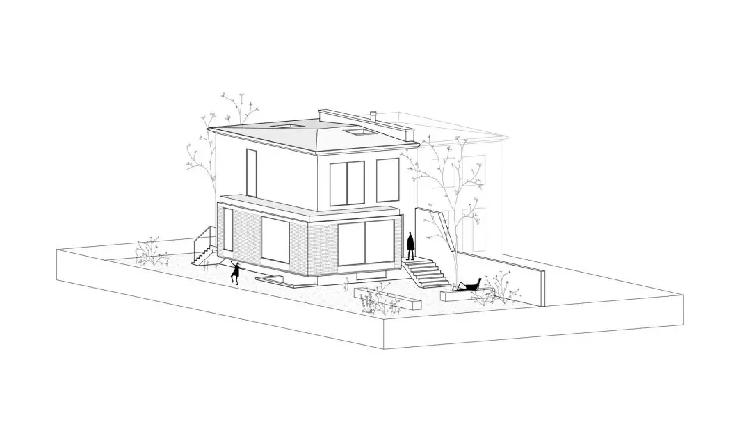







How can a house from the 1970s be renovated while preserving its relationship with the neighboring buildings and, at the same time, fully adapting it to a contemporary lifestyle? In this Warsaw townhouse, the architects at MFRMGR Architekci decided to clearly separate the building’s two facades — on the street side, they preserved its calm, neutral character, while on the garden side, they introduced a new, cantilevered volume that opened the interior to the greenery and allowed for a more organized layout of the home.
A house in need of a new layout
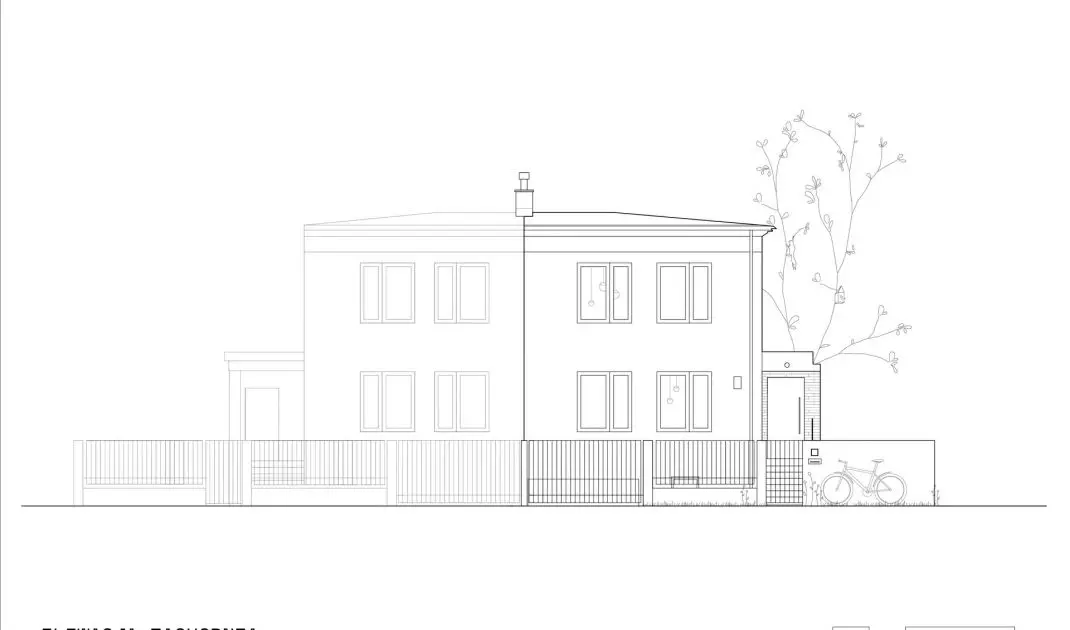
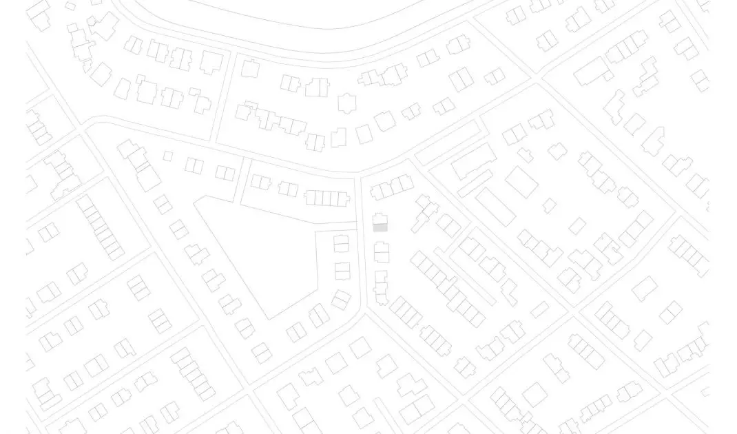
The existing building no longer met the residents’ needs — both its square footage and the existing functional layout limited the possibilities for comfortable use. However, the problem was not solely the size of the house. The original spatial layout, designed several decades earlier, did not fit the contemporary lifestyle, and the centrally located staircase restricted natural light and hindered movement between different areas. The renovation also required consideration of formal constraints — although the building itself is not under direct preservation protection, it is located in an area that is. The architects therefore adopted a strategy in which alterations to the existing building volume facing the street were kept to a minimum, while more significant changes were made on the garden side.
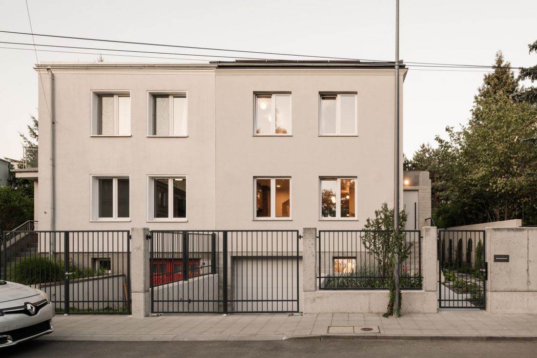
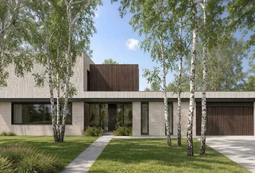
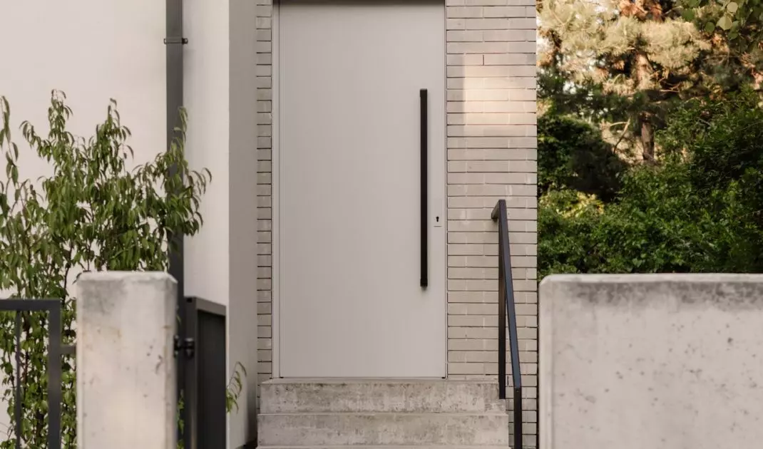
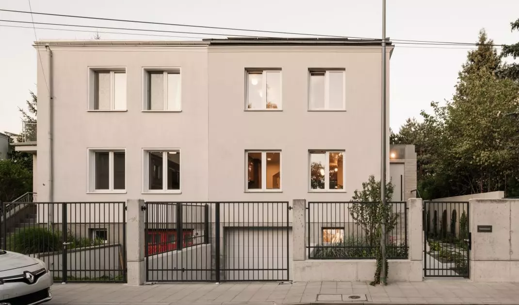
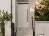
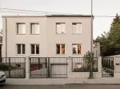
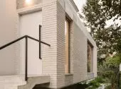
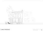
The building’s front facade is very understated and matches the style of the adjacent segment.
Photo: ONI Studio
Neutral from the street, open to the garden
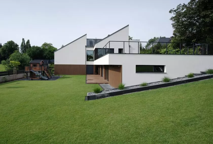
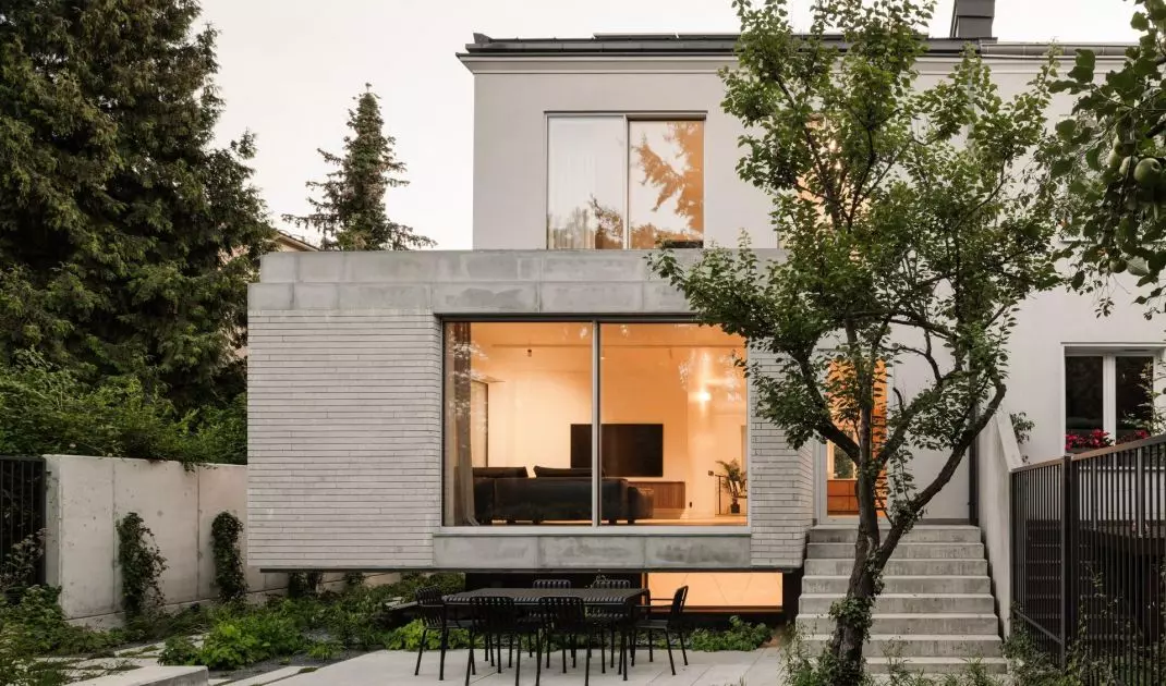
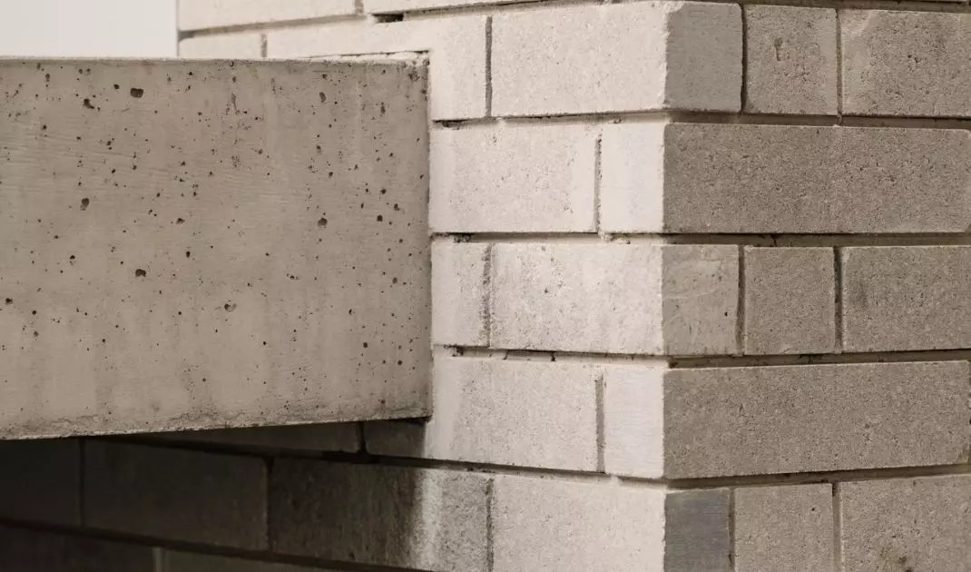
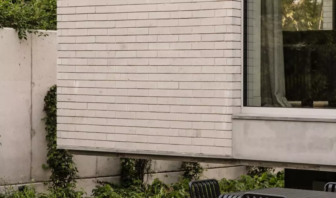
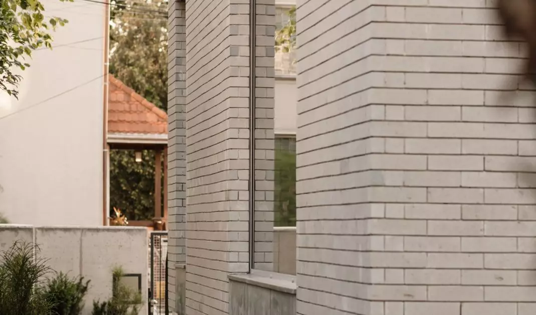
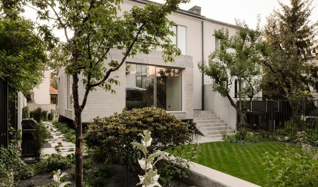
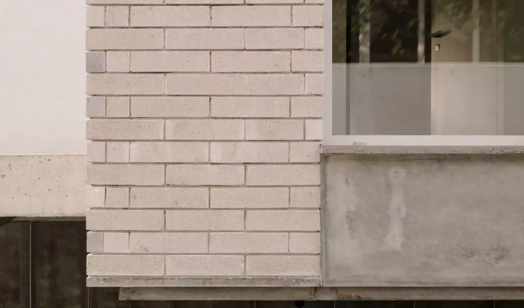
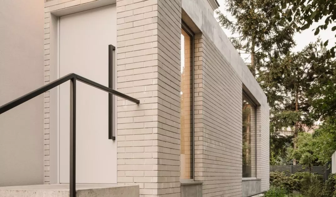
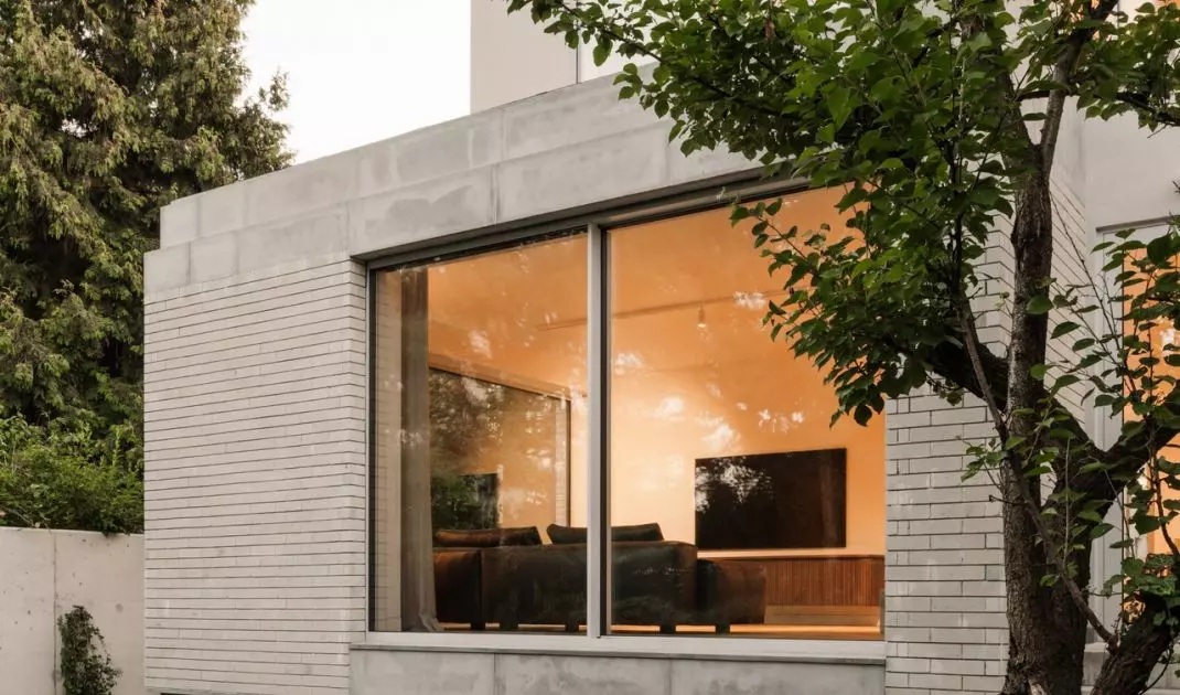
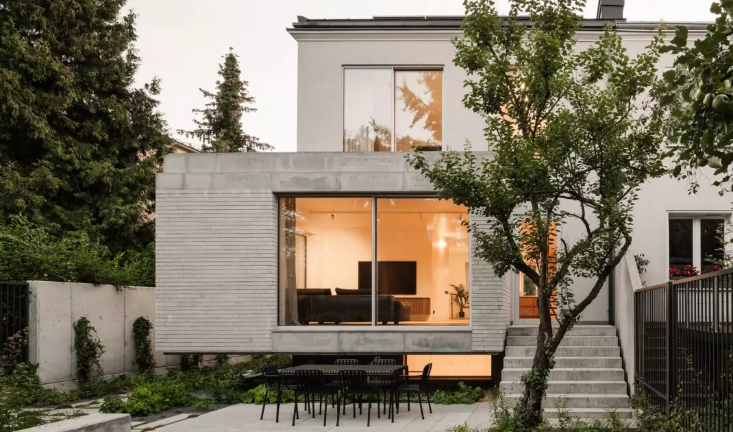
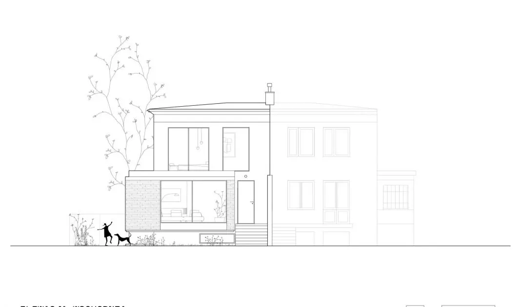
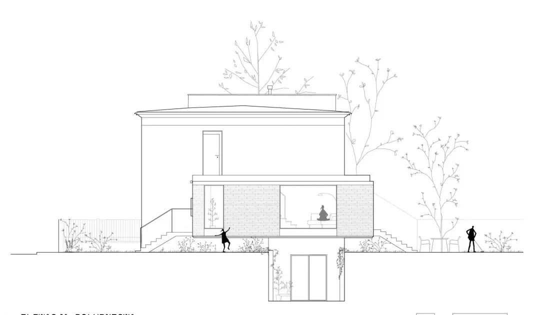
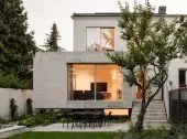
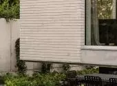
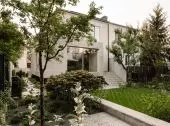
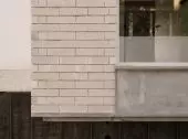
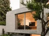
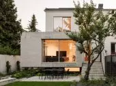
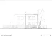
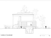
From the street side, the house was designed to maintain visual continuity with the adjacent segment. The facade received a light gray finish of natural plaster, and the existing proportions and character of the front were used as a reference point for the new design solutions. The windows were also recreated with their original divisions, ensuring that the renovated building does not stand out from the surrounding structures. The garden-facing facade was treated quite differently. This is where the most bold architectural gesture appears — a cantilevered volume that extends beyond the existing outline of the house. The new section was finished with gray concrete brick and complemented by large glazed areas. As a result, the addition is not merely an expansion of usable space but serves as a tool for shaping the relationship between the interior and the garden. The cantilevered volume also features specially designed precast concrete elements that subtly organize the composition of the facade and serve as a detail that complements the rhythm of the brick wall.
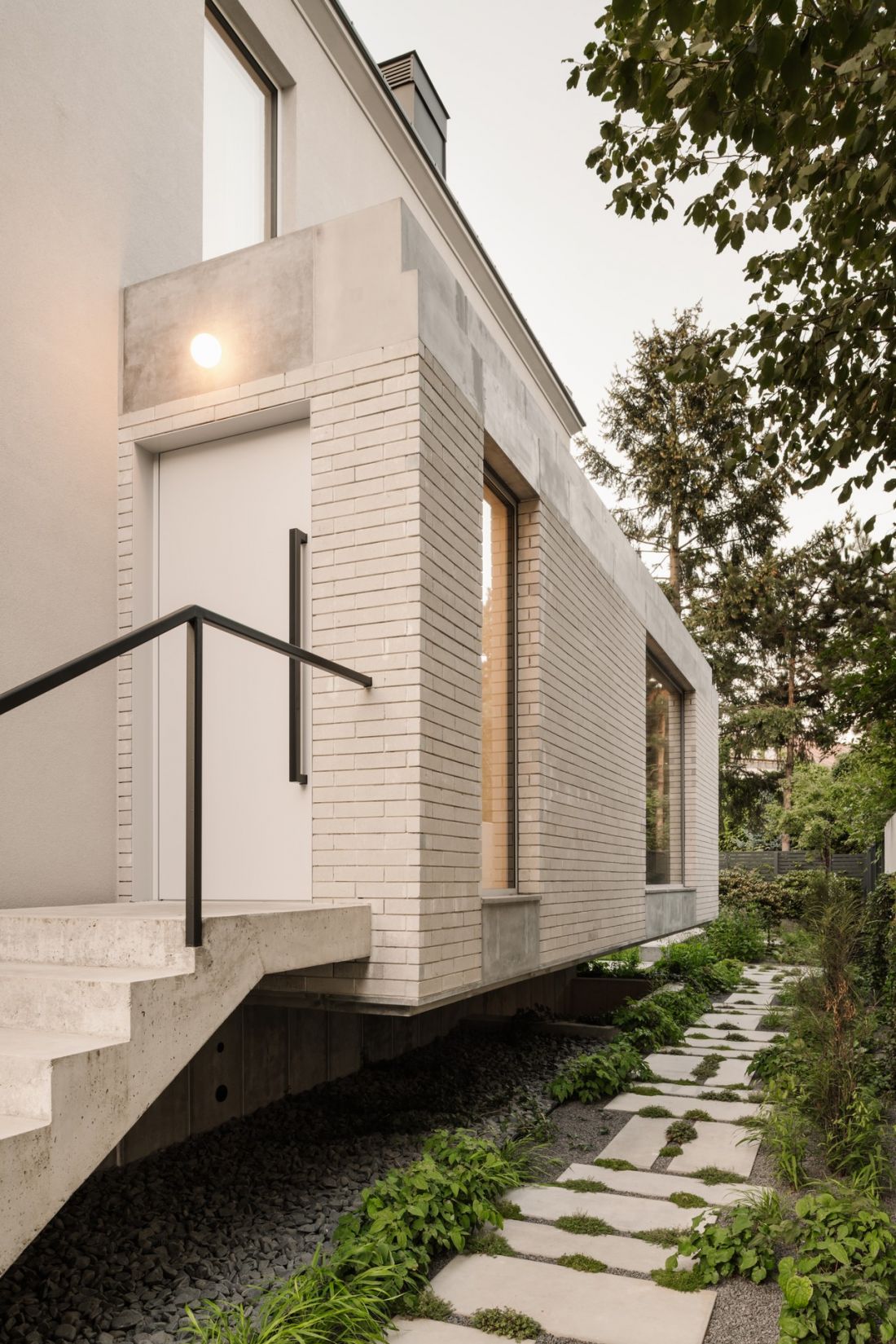
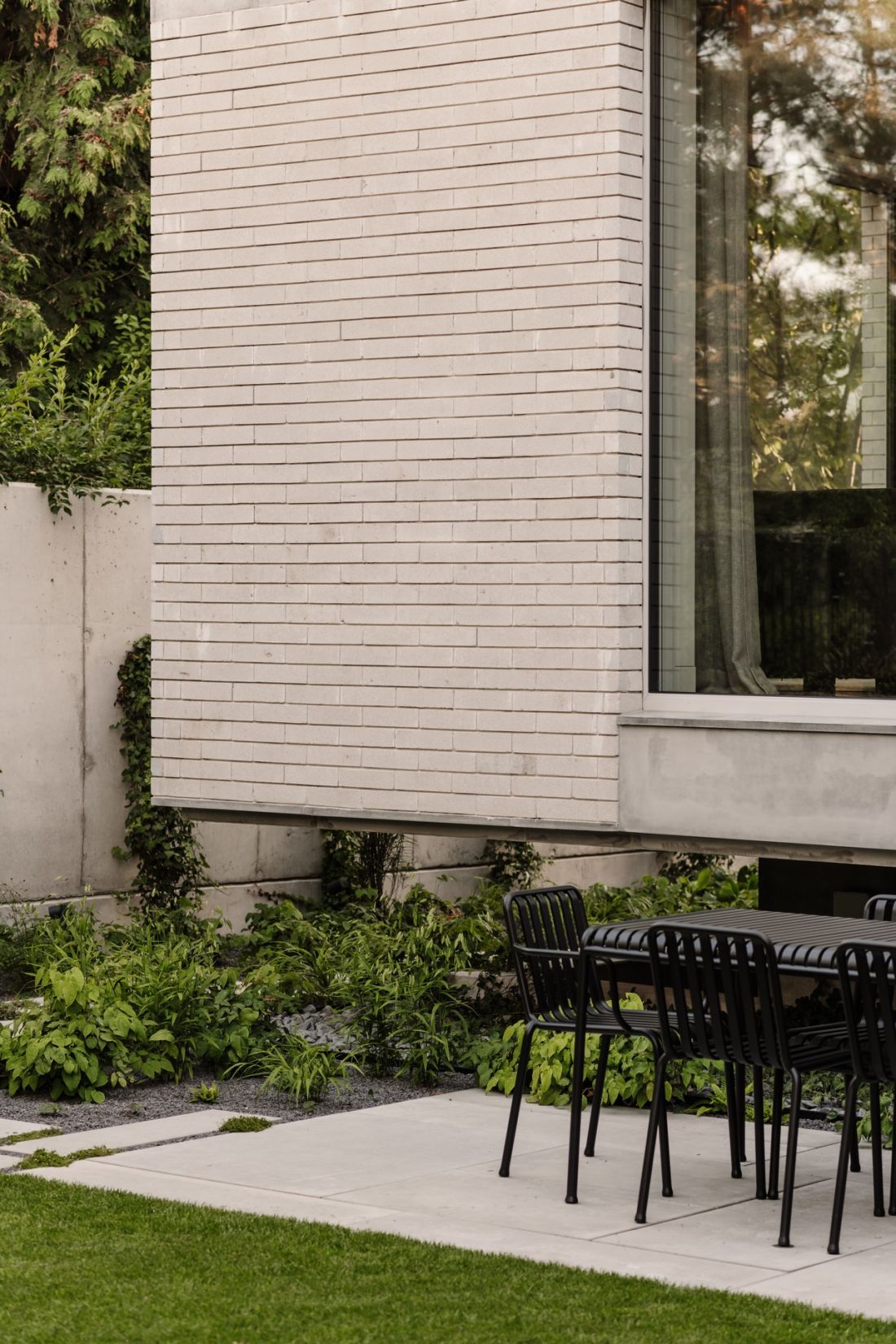
The cantilevered section of the building lends it an additional sense of lightness.
photo: ONI Studio
New Circulation, New Layout
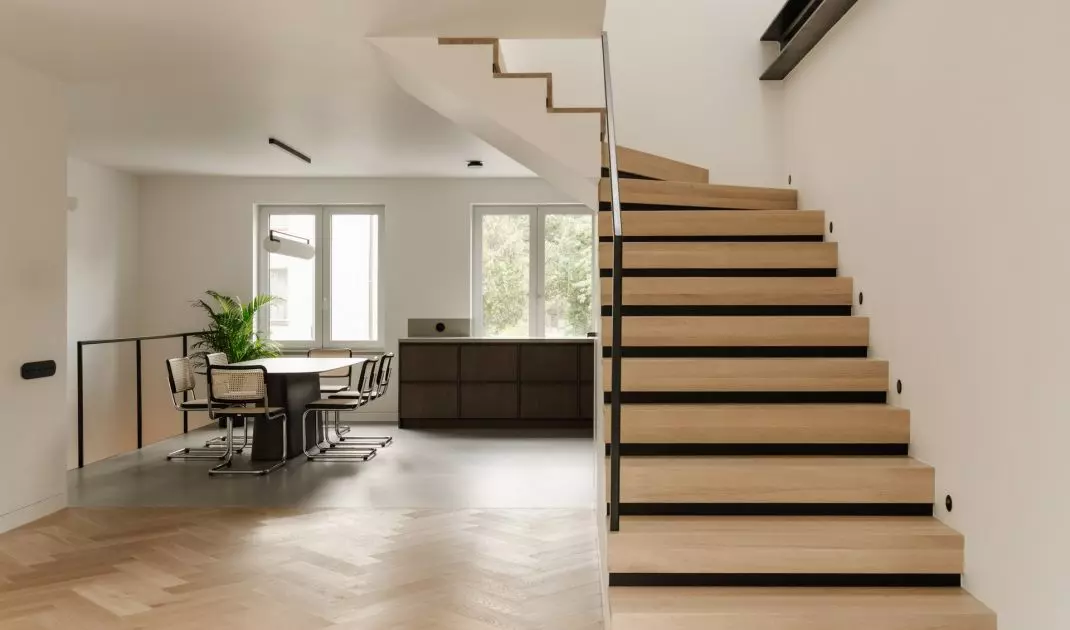
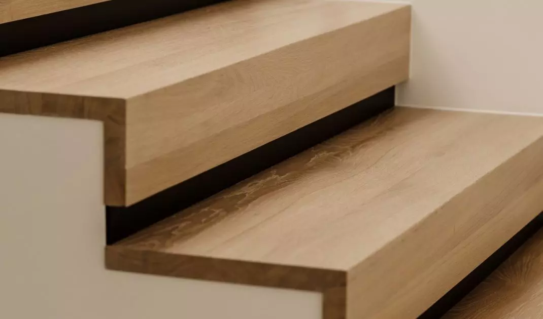
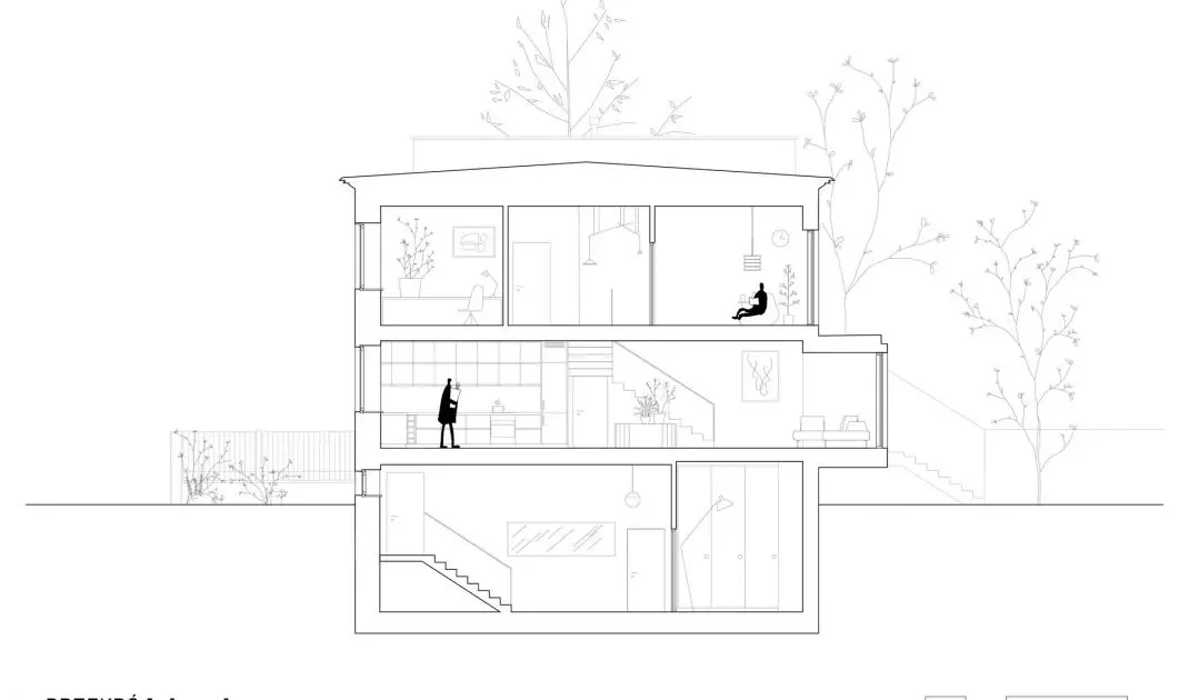
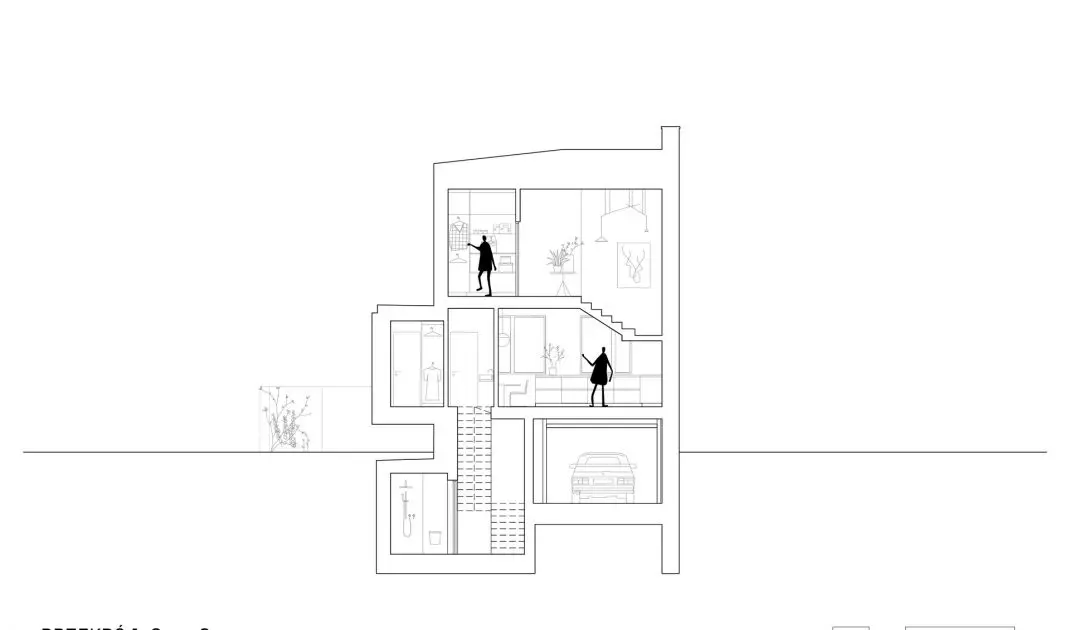
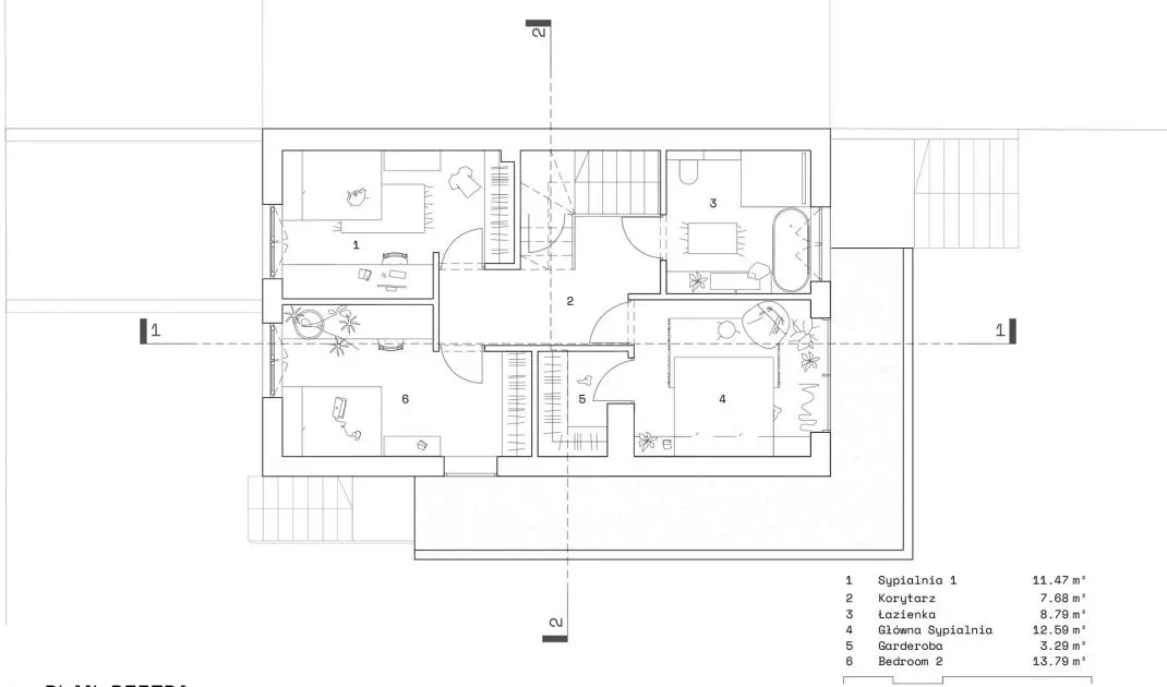
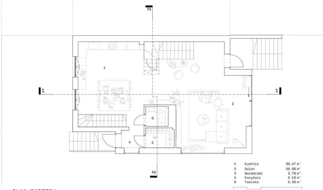
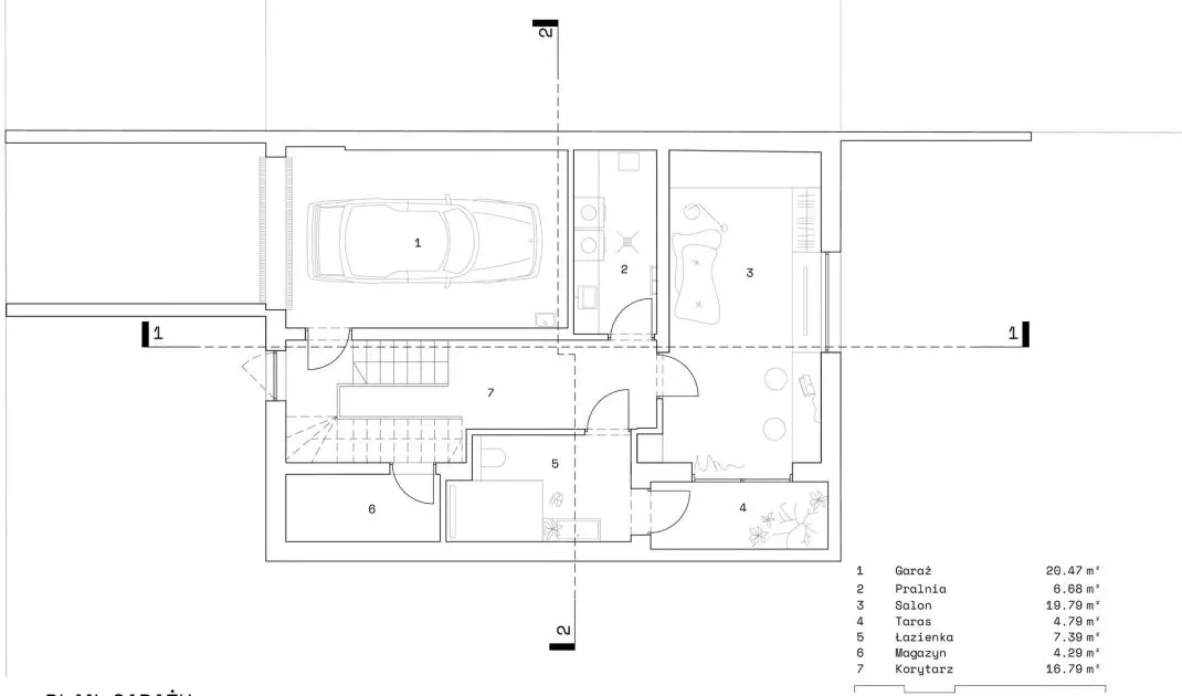
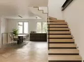
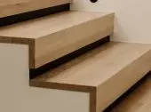
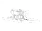
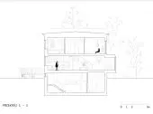
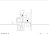
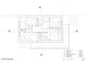
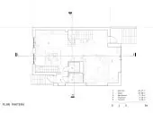
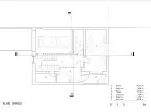
One of the key stages of the renovation was the reorganization of circulation — both horizontal and vertical. While maintaining the existing ceiling heights, the architects virtually redefined how the interior functions. The central stairwell, which previously restricted light and complicated the relationships between rooms, was replaced by two open stairwells. The first leads from level -1 to the ground floor, while the second connects the ground floor to the first floor. This solution not only improved the clarity of circulation but also allowed for the individual floors to be opened up, creating more fluid connections between the different areas of the house.
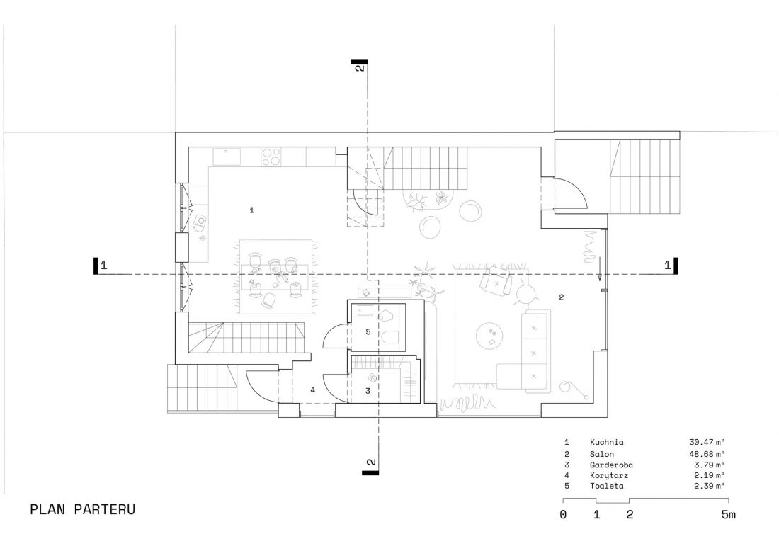
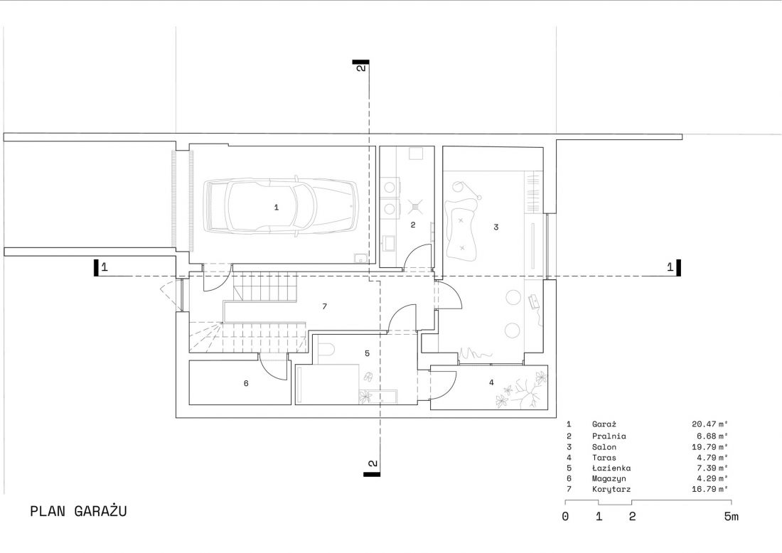
Illustration: MFRMGR Architects
A house divided into three levels
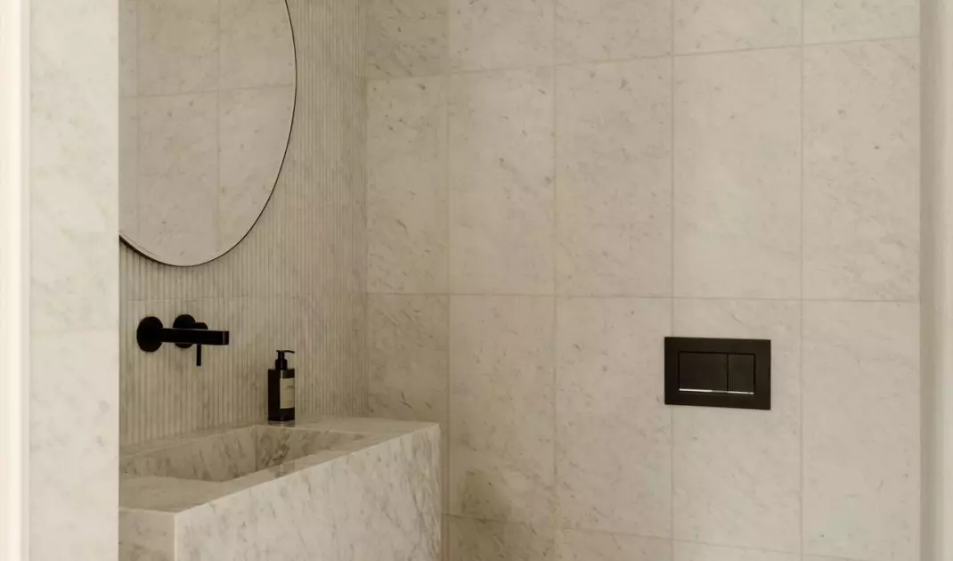
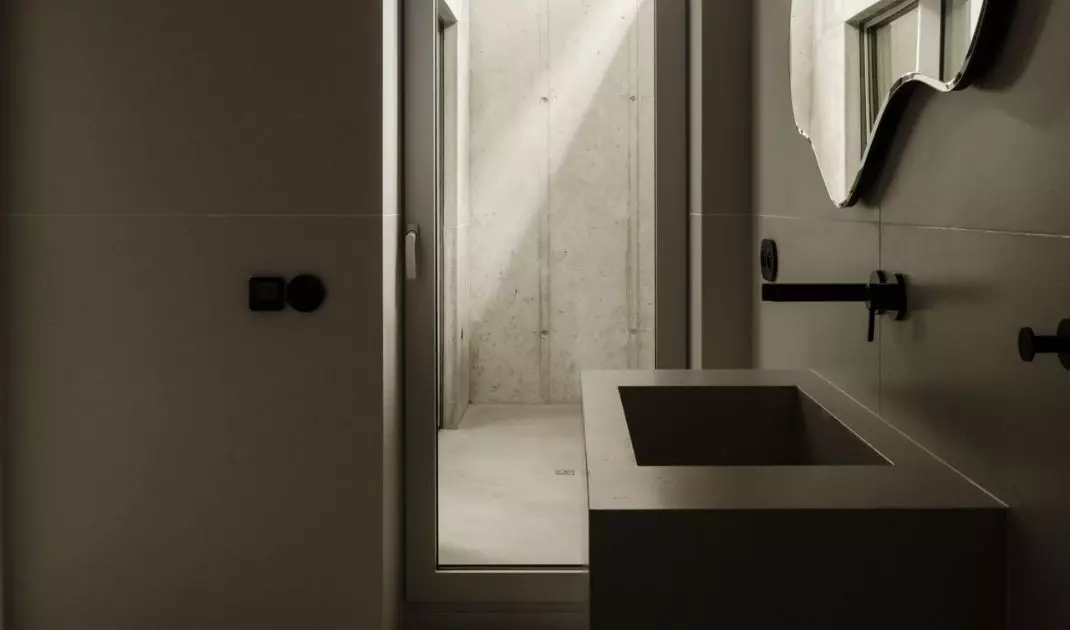
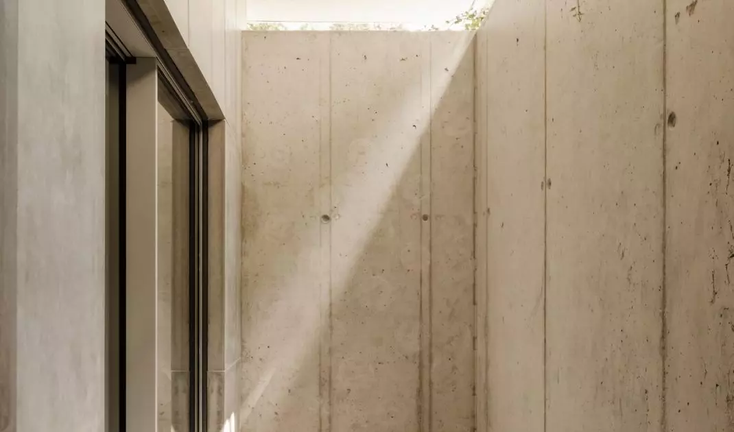
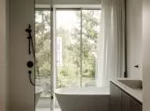
Another key element of the renovation was the deepening of the basement. Level -1 now houses the garage, utility and storage rooms, a bathroom, and an additional room. To ensure that selected rooms receive natural light despite being below ground level, light wells were installed to bring light deep into the underground portion of the building. On the upper floors, the layout was designed to accommodate the family’s daily life. The ground floor houses the most important common areas — from the entryway with a coat closet and restroom, through the large kitchen with a long countertop and dining area, to the living room with direct access to the garden. The first floor features three bedrooms, a bathroom with a tub and shower, and a walk-in closet. The owners’ bedroom also has access to a terrace partially located above the living room.
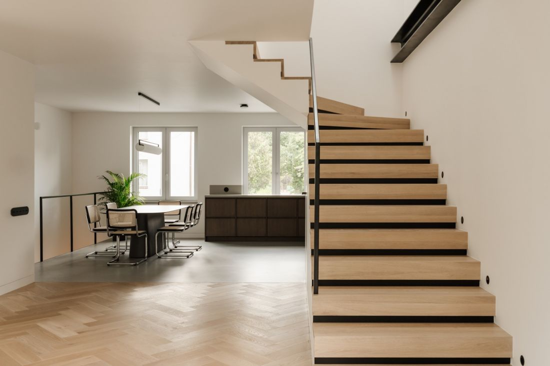
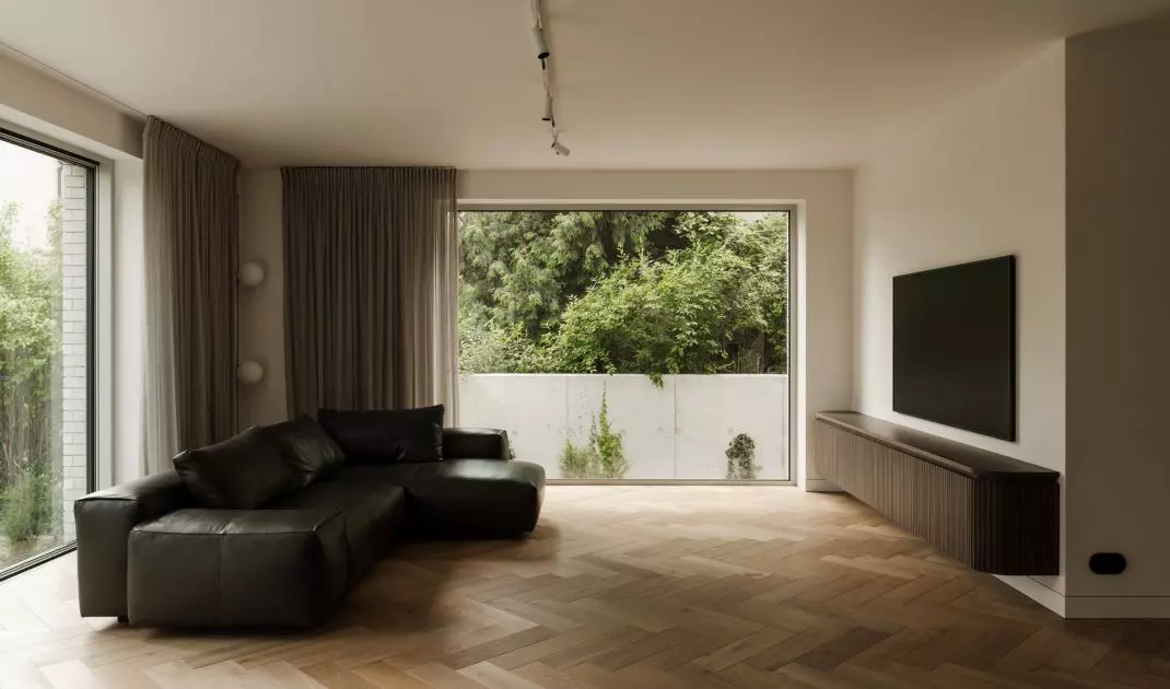
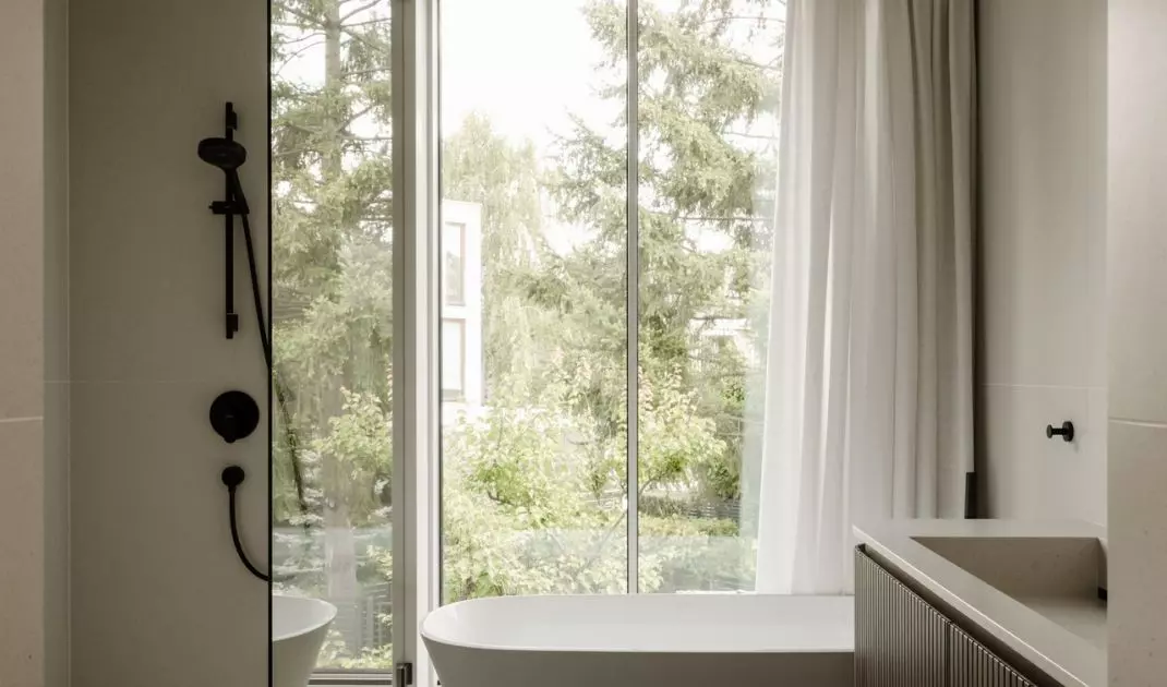
The home’s interiors are simple and designed in a modernist style that echoes the building’s architecture.
photo: ONI Studio
An overhang that transforms the interior
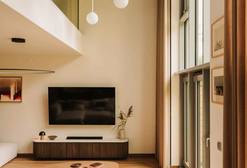
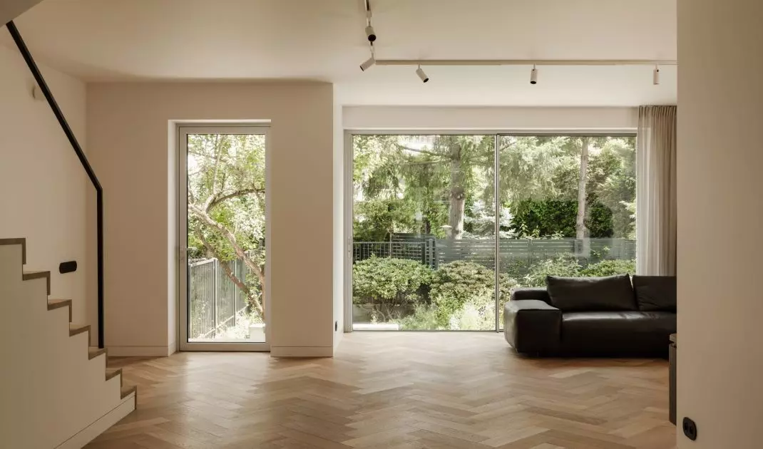
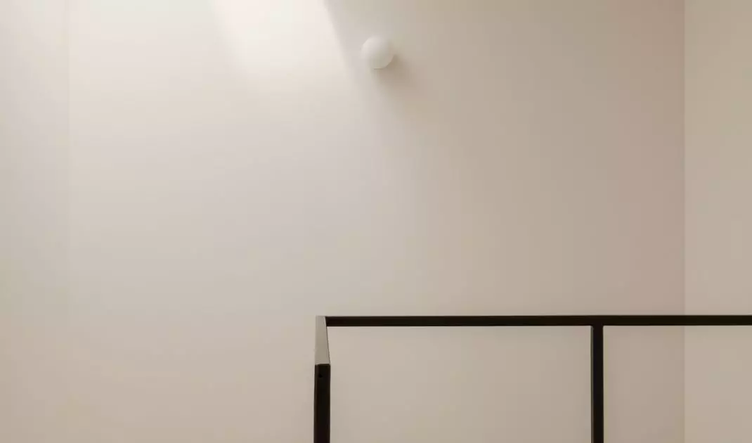
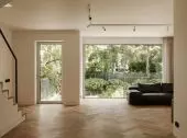
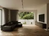
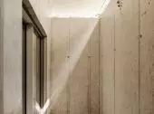
Extending the building’s footprinton the ground floor made it possible to create more space for the kitchen, dining room, and entryway, while also enlarging the living room. As a result, the living area gained a much more open layout, and large windows could be placed exactly where they were most needed. As a result, the interior opens up to the green surroundings, while the garden is visible from the main living areas, almost as an extension of the living space. The design also incorporates skylights. Installed above the staircase and hallway, they allow the central areas of the house to be illuminated by overhead light, transforming the circulation areas from mere transit spaces into full-fledged elements of the interior composition.
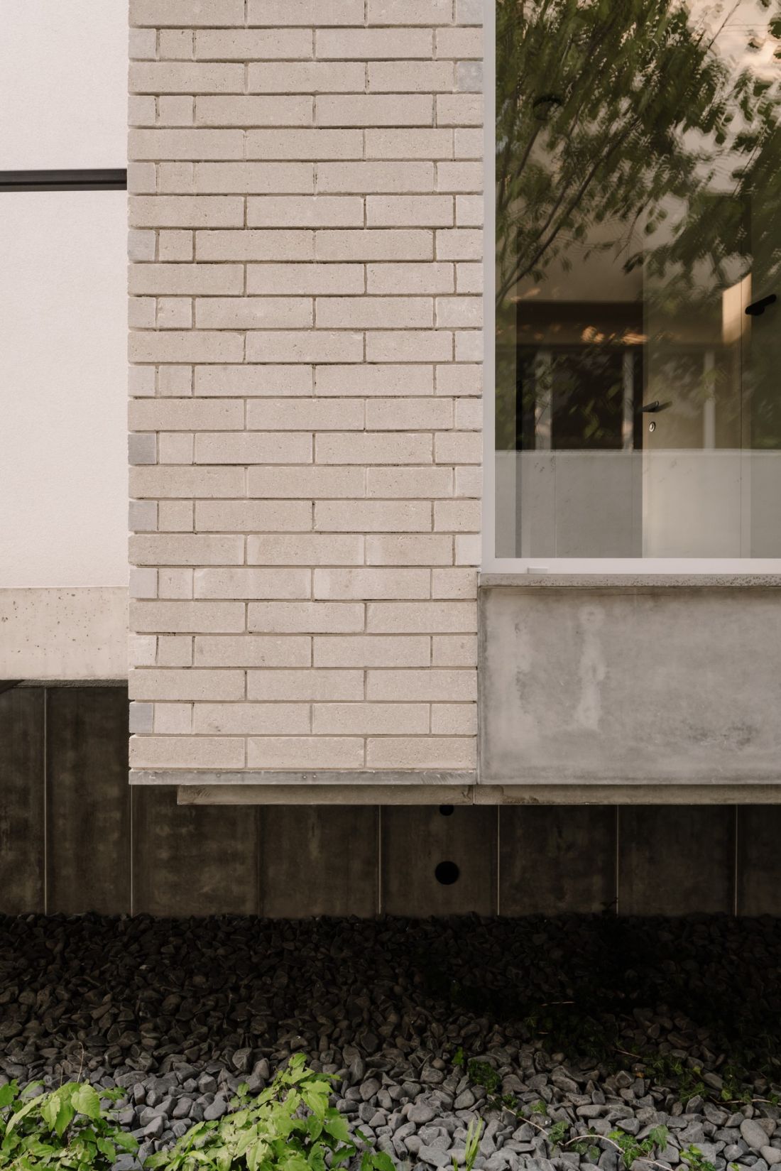
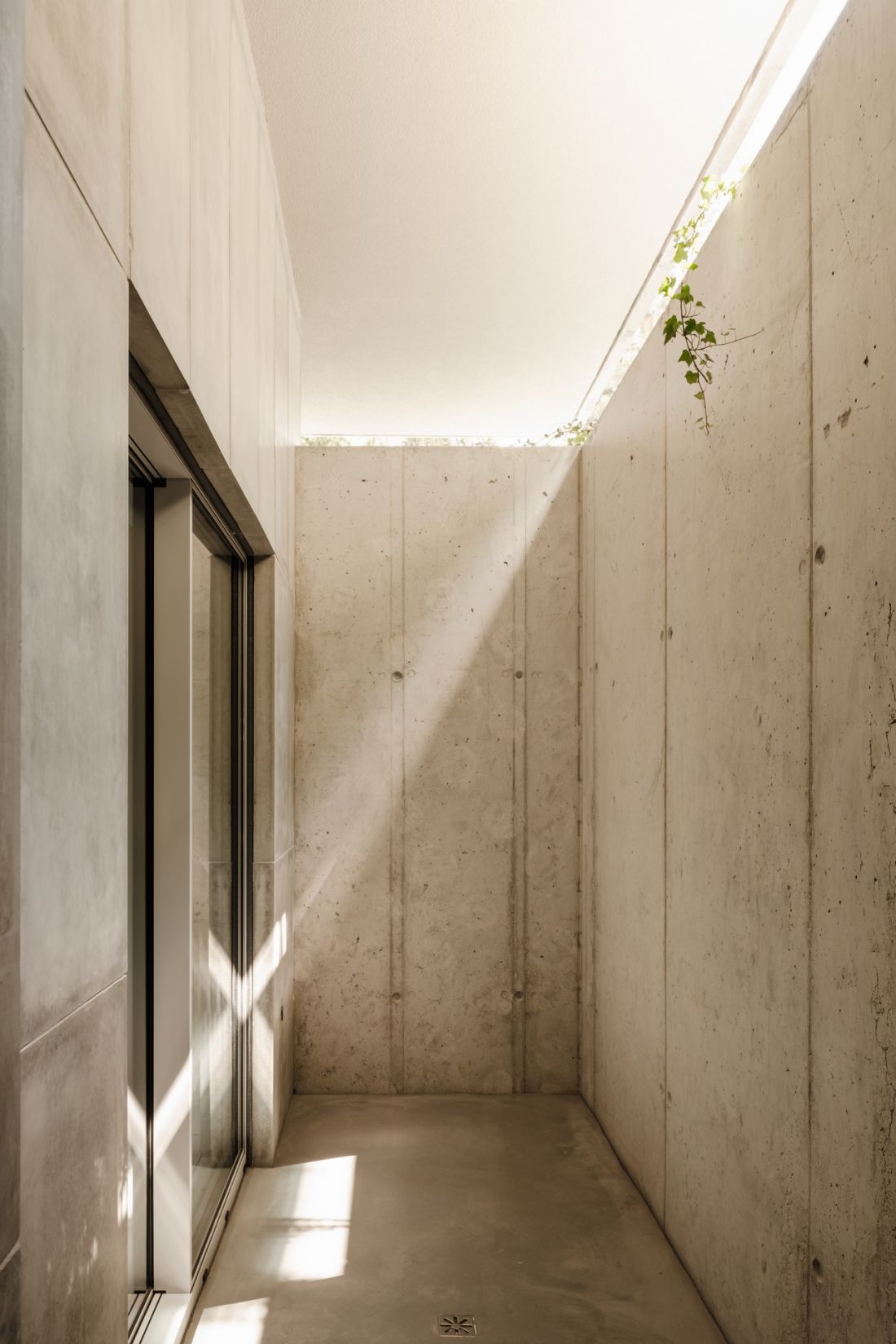
Light plays an important role in the design. The use of skylights and additional lighting in the basements ensures that light reaches exactly where it is needed.
Photo: ONI Studio
interiors dominated by wood, concrete, and light
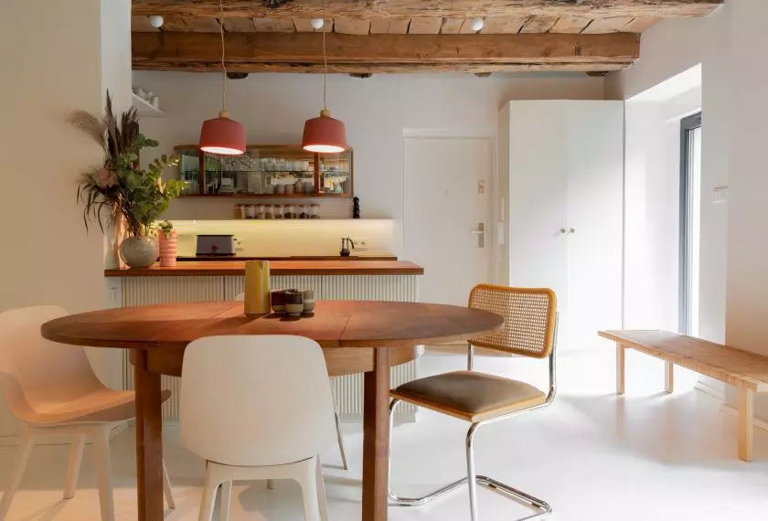
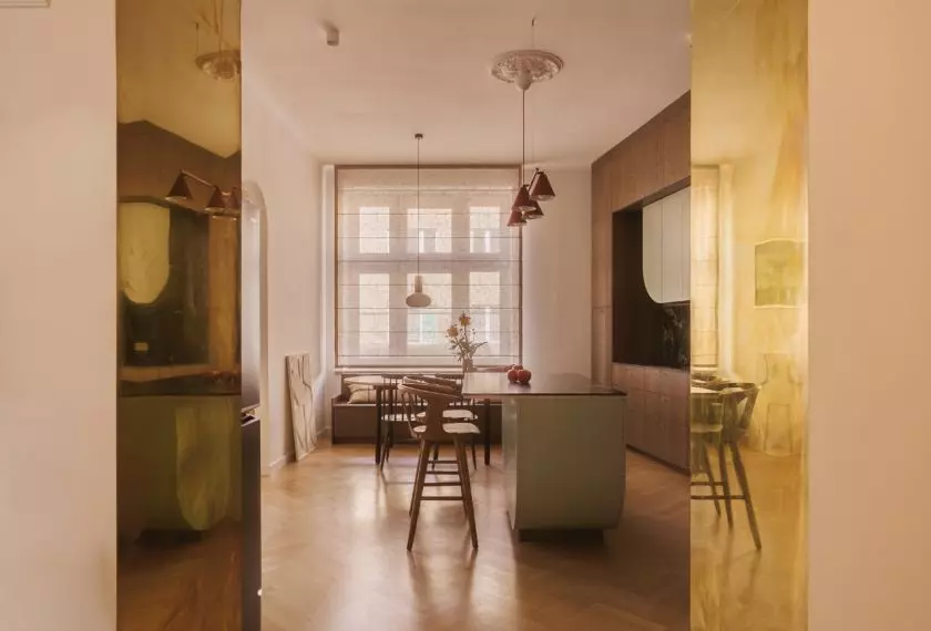
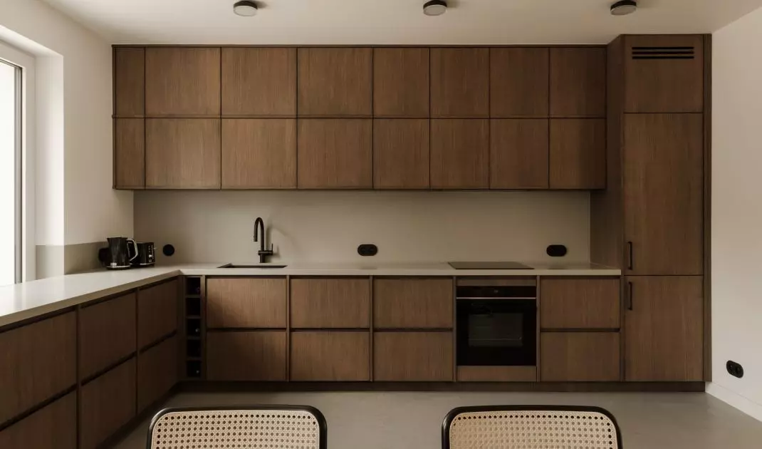
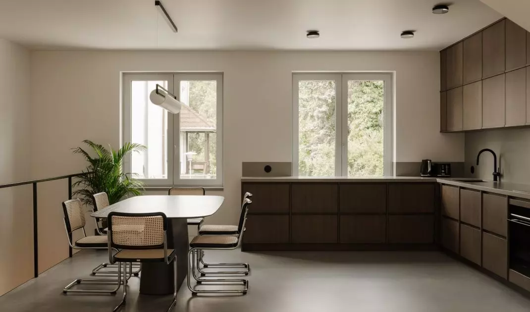
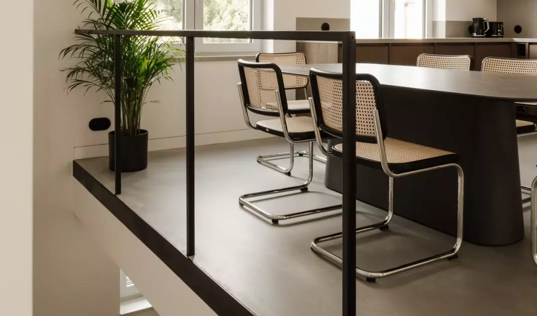
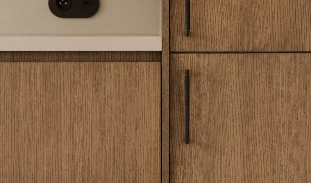
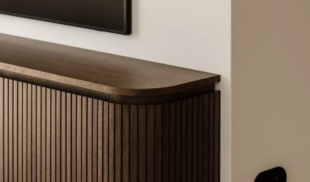
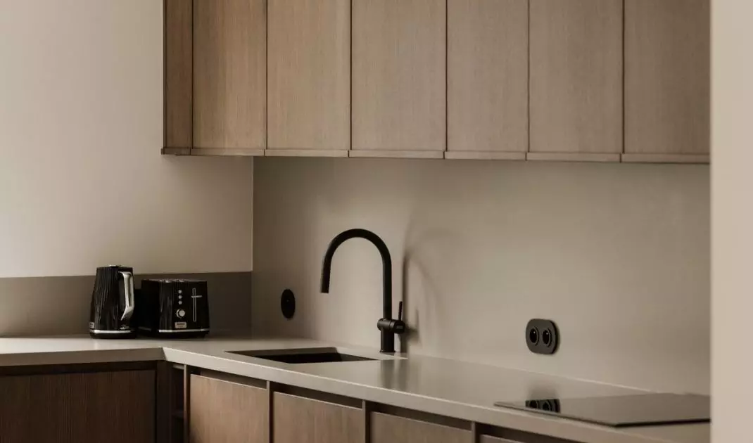
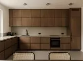
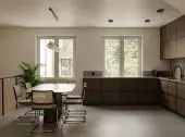
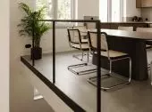
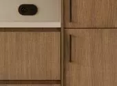
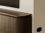
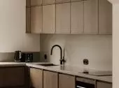
The serene exterior architecture finds its continuation inside, where a limited palette of materials and colors has been used. The foundation consists of light-colored surfaces, natural wood, and concrete, paired with black accents and the deep hue of the wooden kitchen cabinets. In the living area, the floor features oak planks laid in a herringbone pattern, which warms up the minimalist space and introduces a softer, more natural touch. In other parts of the house , polished concrete was used , whose raw character is balanced by wooden cabinetry and furnishings. This combination of materials is consistently carried through the various rooms, ensuring that the interiors maintain a sense of cohesion despite their different functional purposes. The kitchen was designed as a unified unit with a distinct, almost furniture-like character. The cabinet fronts, finished in a darker shade of wood, form a large, orderly surface that conceals both storage space and appliances. The light-colored countertop and neutral background help maintain visual balance, while black elements — such as faucets, electrical fixtures, and lighting details — recur as a subtle motif also present in other parts of the home. The dining area is organized around a large table, accompanied by lightweight chairs with woven seats and backs and chrome frames. Their design introduces a subtle nod to classic modernism into the minimalist interior .
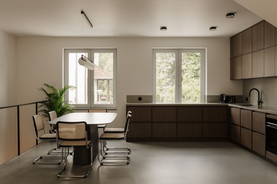
The dark kitchen cabinets stand out against the light-colored walls.
Photo: ONI Studio
Consistency from the Building’s Form to the Finest Details
In this project, the ability to integrate architecture and interior design within a single design process proved particularly important. Entrusting the team with both the architectural and interior design allowed for continuity in material, functional, and formal decisions — from the shaping of the building’s form, through the layout of circulation, all the way to the details of the furnishings.
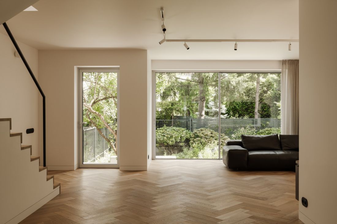
In the living room, the glass walls that open onto the garden play a key role.
photo: ONI Studio
function takes center stage
The renovation of this 1970s house was therefore not simply a matter of expanding the existing structure. The most important change concerned the way the building functions — how it guides residents between floors, how it utilizes light, how it opens onto the garden, and how it separates the private zone from the shared one. Understated from the street and decidedly more open toward the garden, the building preserves the context of its location while gaining a new structure that meets the contemporary needs of its residents.